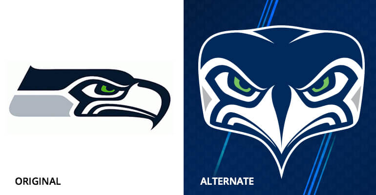
While start of football season is big news, the Seattle Seahawks launched a new alternate logo a couple of week ago (almost) overshadowed it. The reactions from people on social media were overwhelmingly negative, but also pretty entertaining (some compared it to The Simpsons’ Mr. Burns or a baby ostrich). It just goes to show that when you’re redesigning a logo, it’s important to get it right and not be too trendy—especially with a brand people really love (like their football team).
You want your brand mark to last, so here are some tips to achieve just that:
Keep the graphic elements that make your brand “yours.”
Updating or modernizing a brand logo doesn’t mean you have to change everything. It means keeping those graphic elements customers relate to most and updating from there. A good example is MasterCard®. Everyone knows MasterCard® for the red and orange circles, so it would have been detrimental for them to abandon such familiar elements. Instead they built upon that icon, simplifying it and, in my opinion, making it much cleaner and fresher.
Preview your new logo, if possible.
Make sure your customers aren’t going to freak out over the new look. It’s impossible to please everyone, but it is important to get feedback from some of your loyal followers. With social media at everyone’s fingertips, opinions can get out there fast—especially negative ones—as it did for the Seahawks.
like what you’re reading?
subscribe to our newsletter
"*" indicates required fields
Keep it simple.
An example of a football franchise that refreshed their logo and got it right is the Miami Dolphins. When they updated their logo in 2013, it worked. Why? They kept the key elements of the brand and came up with a new logo that is simple with a minimal transition from the old one: It’s a more modern, sophisticated dolphin, with slightly brighter colors but in the same palette and with an updated sun. They removed the dolphin’s helmet (which wasn’t necessary, in my opinion). The lesson: Sometimes less is more.
Make sure it works at all sizes.
Big or small, your logo should work, and updating a logo to a simpler, cleaner version can be great for readability. Some older logos have a lot of detail—sometimes too much to be read in today’s smaller digital formats. You need a quick read, and this factor could help you decide if you need to update. The Tampa Bay Buccaneers got it right with their logo update. The newer one is much easier to read, with cleaner lines and bigger type.
So, what’s my opinion about the Seahawks’ new alternate logo? Personally, I think they should’ve stuck with the original one. It’s already clean, simple and current. They tried to make a version that was a front view of the hawk, and it just looks like they squished the profile and mirrored it. For something that will be all over apparel and memorabilia, they pretty much fumbled. (Maybe they should’ve considered some of the tips above.)


