
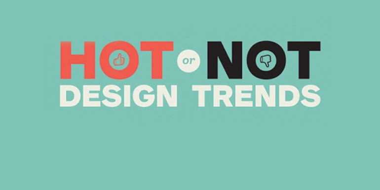


Why are artists so passionate about their work? Could be because the design field remains in a constant state of change, always growing and expanding in surprising ways. It could also be that while trends certainly evolve throughout the years, they sometimes come back full circle. The successful ones catch and hold an audience’s (or generation’s) attention not only appealing to the majority of its collective taste but also influencing future artists. Like any other trend—clothing style, hairdo or even the latest diet plan—design that keeps up with the times can also define a decade.
In the late 1990s and early 2000s, the intricate, textured design style known as bevel and emboss, which used layers and patterns to create special effects, was all the rage. Not so in 2018. Today’s preferred design is minimalistic and flat. Current headlines and text usually have no effects at all. The simplicity of this is eye-catching and pleasant to read.
Another example of an outdated design element is the beloved burst. This was mainly used in print ads to call out an impending sale or special offer. A burst is a very literal way to grab the viewer’s attention, especially when using bright colors. Often these bursts do not flow with the other elements on the page and feel intrusive to the surrounding content. However, more modern design takes into account the surrounding elements, making the callout cohesive with the ad but different enough to stand out.
One of the more popular design trends that is making a huge comeback is the use of gradients. In the 1990s, gradients were used on everything from website buttons and PowerPoint presentations to magazine ads but became used less as designers began leaning towards flat design. Now that flat design is evolving, gradients or “color transitions” are making a comeback. The more recent utilization of gradients includes a smoother, more vibrant transition and is often accompanied by the flat visuals.
Even color schemes have had their time in the spotlight throughout the evolution of graphic design. Pastels and neon colors were popular in the 1980s and 1990s and are once again being used to grab the attention of consumers. Bright colors are usually eye-catching and help design stand out, but using color schemes that were popular in past decades may even add a touch of nostalgia, making it more appealing to millennials.
Looking back at design trends throughout the past can help influence artists today. It is clear that outdated style can find its way back around. Advertising will always try to keep up with the times and appeal to the taste of its consumers so it is important to know your audience and embrace the past. We would not have some of the beautiful art we have today without inspiration from the past and the wonderful evolution of design.