


In the creative world, there’s no greater insult than “THAT’S BORING!”
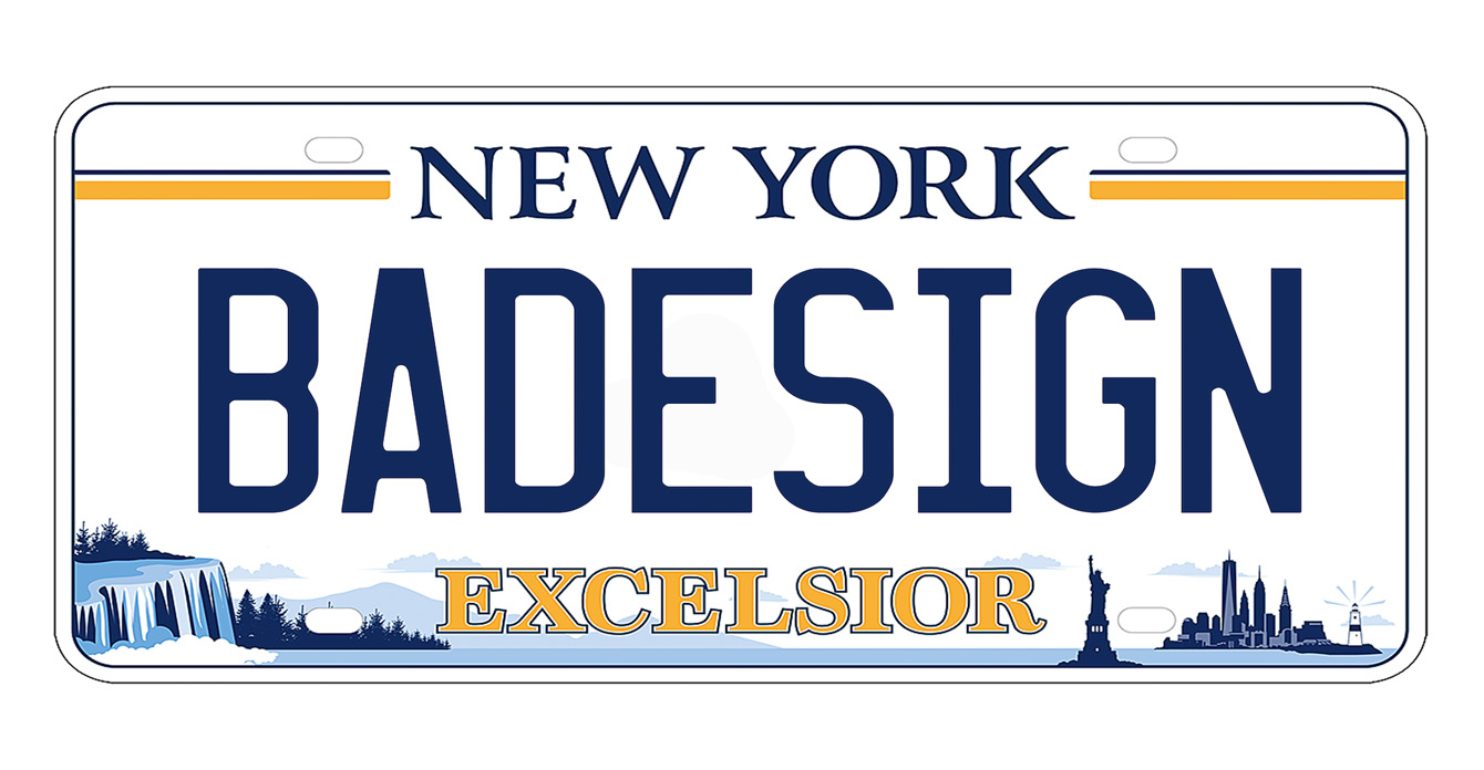
But have you seen the new design for the next generation of New York state license plate?
(*gagging sounds*)
It’s horrible: Simultaneously ugly, confusing, and yes . . . boring.
Why get so worked up about a license plate? Most people overlook them or can’t remember them even when they’re looking at them.
But for creatives like me, every blank canvas is an opportunity for excitement and inspiration. It’s a chance to tell a story or to convey a piece of your personality. It’s almost always a chance to begin selling something, whether that’s a product or an idea.
Most states have had their license plate designs for decades and have built a brand with them:
- Connecticut is welcoming and comfortable, with colors and typeface that play into the DNA of the state.
- Michigan is simple and not over designed with a clean presentation.
- California utilizes a hip script font that exemplifies the mood of the state, with a carefree and organic look.
- Mississippi uses a font with personality (even if their literacy rate is the worst in the country).
Although the Empire State’s ever-changing license plate may be nothing more than a money grab (that’s a political conversation for another day), they could still do better than this monstrosity. It’s a lazy combination of the two plates that have come before; it’s overly detailed; and doesn’t strike out into bold new territory that has always defined the spirit of New York. Plus, we’re the home of Madison Avenue, home to some of the best marketing firms in the world, and this is what we come up with?
The DMV has missed an opportunity to make our state’s plates stand out along the mosaic of other plates flying along the highways.
I see plenty of people (including some in our office) who couldn’t care less about their license plates. Many are still driving around with the white and blue designs from two generations ago. I just paid to upgrade mine to the yellow and blue design. Now a year later, you’re asking me to upgrade again?
“Excelsior” means exceptional. This is anything but.