


 A mobile website is, well, just what it sounds like: It’s a website that is meant to run well on mobile devices. And by mobile devices we don’t necessarily mean just the smartphones for which mobile apps are developed. These include a whole range of “less smart” phones that provide access to the web but don’t run apps at all.
The types of devices that can support mobile web access vary significantly, with a wide range of screen sizes, varying resolutions and even limited colors. In fact, some phones are still monochrome! This means that a web developer must design a site that will display correctly in a very limiting environment.
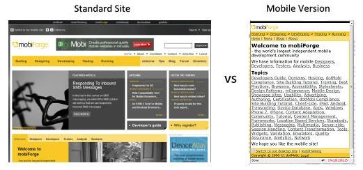
Most often, a mobile website is a highly pruned, minimalistic site: One that focuses on just the core functions; provides minimal navigation; uses smaller graphics; and includes few or no frills like flash, motion or java script. Take a look at this comparison of the desktop versions of the mobiForge site and its much simpler mobile one.
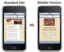
Here is another comparison. In this case, the desktop version of the site is displayed on a higher-end smart phone. But even though the phone can display the site, it is unreadable. Notice how the mobile site has been stripped down to the core functions.
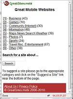
And here are some additional mobile websites. Again, they all are minimal in design, content delivery and very “to the point.”


The bottom line is that a mobile site is a simple, no frills website designed to display properly on a small screen, in a minimalistic environment and on a variety of cellular devices. The content and navigational queues on mobile sites are straightforward, and most use text-based links and few images.
The mobile site is designed for a different user than the desktop version of the site, and in many instances they reach more people than the desktop version of the site. We recently illustrated how mobile web access is expected to soon surpass desktop computers as the primary point of entry to the internet, particularly in international markets. In many remote locations in the world, mobile may be the only internet access.
When considering a mobile site, consider your audience. If you’re primarily a B2B site doing business mostly in the U.S., it’s not unreasonable to assume that most of your visitors may indeed be desktop users, in which case your core asset is the site designed for desktop viewing. Even so, it may be advisable to have both versions of your site available.
Mobile Websites: Technology Considerations
Regarding technology, there is still some debate about exactly what the best solutions are for mobile websites. It is possible to use CSS (style sheets) as a solution. In theory, the proper use of CSS can make your site display differently on different devices. In a perfect world this would work, but not all manufacturers have adhered to the standards of the @media tag. This has made many devices behave unpredictably.
In addition, there are many types of mobile devices. Some are capable of displaying websites in a fully operational browser, making it look very much like the desktop site (albeit, much smaller). Most of the higher end smart phones can deliver most web content and run most functions successfully, except for Flash, which is not supported on most smart phones. (Apple has officially stated that it has no plans to provide support for flash now or any time in the future.)
There are two approaches to providing mobile sites. They are:
- Design your core website so it works (somewhat successfully) on most mobile devices, or
- Create a separate site that is fully optimized for the mobile environment.
While the first approach is an attractive solution – it leaves you with only one website to maintain and operate – consider its benefits and risks:
- Benefits – A single site may be designed to degrade gracefully so that as the capability of the device decreases, unsupported functions drop off the site and the format changes accordingly. This is a very attractive option that provides a potential solution for the varying capabilities of multiple devices – display all on desktops, resize for an iPad, change display size for an iPhone or Android, go to text for a low-end mobile phone, etc. This option holds promise, but has yet to be fully mastered by most developers.
- Risks – The navigation of a desktop site may not be so well suited to the minimalistic navigation of a less powerful device. This, in turn, can make even a well-designed site seem poorly organized and poorly planned as navigational options and queues drop off. You could easily be left with a site that seems to be a mishmash to a low end user, and this could cause frustration and usability issues. Also, the amount of time and effort needed to design and code this type of site could drive the cost up to equal or beyond the cost of building a completely separate mobile site.
The second approach is one that many companies (like those illustrated in the samples above) have opted for. But, like the previous approach, there are also considerations:
- Benefits – You are certain how the site will function. You can minimize navigation and change the navigational structure so it is well organized for any mobile user. You can develop relatively simple code and simplify testing. In general, the site will be more predictable. You know with certainty what the results will be and you choose purposefully the most important features to retain in the mobile site.
- Risks – You are maintaining two sites, and you are paying for two sites. There is also a risk that the sites may get out of synch. You need to remember that every update may need to be made separately on both sites. It also possible that you’ll sacrifice some features that high-end user could benefit from in order to insure the site functions on lower-end devices.
All in all, the decision as to which approach to take is an educated guess. It depends a great deal on who your users are. If they are younger or more affluent Americans, they are very likely to have higher-end devices and could benefit from a more sophisticated approach. If it’s important you reach users in less accessible countries or users of lesser means, it may be crucial that keep the site minimal so it will be functional on even the lowest-end devices.
Whatever your decision, I would highly recommend that if your current site is a standard desktop-oriented one, be sure it has analytics installed. The analytics can tell you a lot about who your visitors are and you user base and could be very helpful in providing the information you’ll need to make the most appropriate decisions.
So, are you mobile?