


Apple’s recent release of iOS 9 and their two new device additions—the iPhone 6s series and iPad Pro—bring to the masses new ways to interact on a mobile scale.
The iPhone 6s unleashes an all-new interface technology called “3D touch,” a hardware feature that allows the phone to detect the amount of pressure applied to the screen. This technology can reveal new ways to interface websites and apps with the user. For example, instead of a small slider (which can sometimes be unruly for people with larger fingers, in my opinion), you simply press a virtual button. Press harder to increase the quantity of an item in a cart; to change the size of a slice in a pie chart, simply adjust pressure in that region of the chart. (Fun little fact: The Apple watch has something similar called “force touch.”)
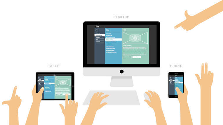
While the new iPhone series has given us a different way to interact with the phone’s touchscreen, the iPad Pro paired with iOS 9 gives us choices in viewing and rendering a website. Since the first iPad, the entire viewing area of the screen was used in full by the browser. With this Pro series, you have the option to take on portions of the screen for the browser to scale as a full desktop, to a standard tablet, down to mobile phone proportions. This means the iPad pro can now adjust to how its owner prefers to visualize a responsive website. With such a feature, we see great potential to target our client’s audiences based on their viewing preferences with a less-limited design constraint.
What do you think of the iOS 9 and the new product lines? Austin & Williams is excited to take advantage of these major advancements to help our clients deliver a better online experience to their audiences.