

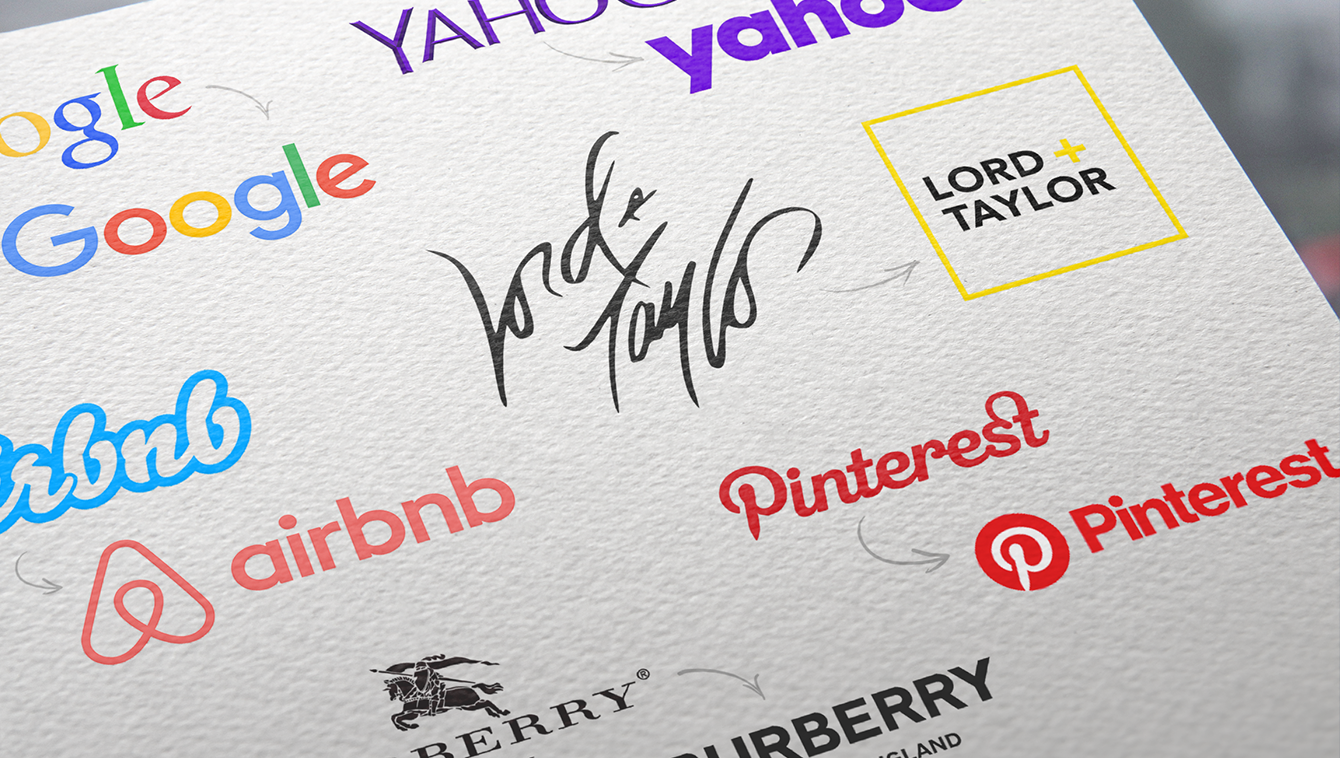


It seems to be a never-ending trend that big companies are opting for a new look: flat, bold and most importantly, sans serif. Companies all across the board have ditched their distinctive logos for something strikingly similar. One begins to wonder: Have we entered an age of design simplicity or creative monotony?
Fashion houses like Burberry have abandoned their modern typeface for a clean, contemporary look. Tech giants like Google underwent a facelift, leaving behind their old serif typeface for something bright and geometric. Countless other companies have also followed suit including Airbnb, Uber and more recently, Yahoo. Why? Is the serif now a thing of the past? Is the future really sans serif?
From scrappy startups to prestigious brands, companies are increasingly taking this common course of action to present themselves as successful giants. Why? Because typographic logos can be extremely tricky. They can communicate trust or uncertainty. They can make your brand seem established or mediocre. They can look expensive or cheap.
The solution has become sans serif! Sans serif logos are today’s trend for several reasons. They lend an air of legitimacy to whatever is being presented. These ubiquitous logos are timeless and functional. They look great in print and on the web, which is so important in the technology-driven world we live in today. They are just as crisp scaled at small sizes as they are at large sizes.
No wonder companies like Google and Airbnb opted for a no-nonsense, geometric sans serif logo. They’re trying to represent the best of technology; if their logos look like mush on screen, then that’s a big problem. Abandoning their quirky typefaces and the fussy serifs allowed them to integrate a cohesive look and feel from a logo standpoint with their user interface. Clarity and simplicity in a UI is key and the same applies to your logo. In the past, designers would look for a concept when designing a logo. Now, the brand is the concept. Many of these sans serif logos look similar – some almost identical – but what they offer is entirely different. The goal of big companies is no longer being noticed. Instead, the goal is having their brand be a big part of people’s everyday lives. Impact and clarity are key in a world where we are bombarded with visuals: Geometric, sans serif logos, achieve just that.