


Estranged twins Jeppe Jarnit-Bjergsø, founder of Evil Twin Brewing, and his brother and competitor, Mikkel Borg Bjergsø, cofounder of Mikkeller, both brew outstanding beers.
But thanks to their art directors, the twins both have distinctively different looks on the shelves.
Jeppe and his copywriter-wife come up with the product names then provide Evil Twin art director Martin Justesen a taste and a look at the beer, and he creates a label from that—often starting sketches when he hears the name of the beer.
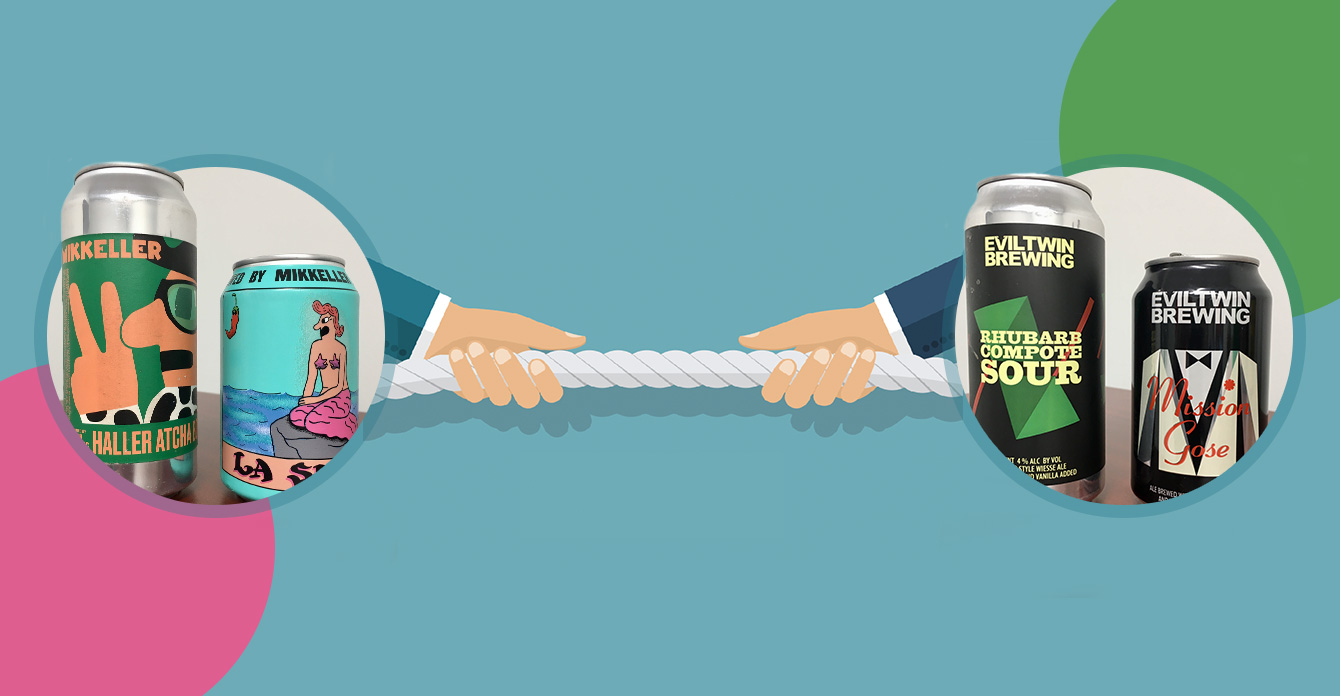
The resulting labels are geometrical and graphic with most labels built up by triangular shapes. The design works on two levels: First, it grabs your attention by standing out on the shelf, and second, it captures your interest and engages you with the fine details you discover when you take a closer look.
The process for Mikkeller is decidedly different—and built on trust. After Mikkel explains a beer’s ingredients and flavor profile, art director Keith Shore is given nearly total creative freedom in developing the imagery (he sometimes even comes up with the names).
Based on sketchbook characters Shore was working on before he started with Mikkeler, the designs are illustration-heavy and rely on the characters and colors to tell the story, while typography takes a backseat. His designs are deceptively childlike, filled with cartoonish figures and bold lines. He favors a bright but limited palette, which helps the bottles stand out in the crowded craft-beer scene.
Same product category, from the same family: Two decidedly different brands. Which one will win the “war of the twins?” Only time—and beer consumers—will tell.