PARK COMMUNITY CREDIT UNION
a new brand that’s with you, all the way
overview
Park Community Credit Union had evolved well beyond its roots, but its brand hadn’t kept pace.
As a Community Development Financial Institution (CDFI) committed to expanding opportunities, Park needed to better connect with the diverse communities it serves. That meant creating a stronger, more distinctive identity that could honor nearly 60 years of history while reflecting the inclusive, forward-thinking organization it had become.
AW set out to build more than a new look. We created a brand system designed to move Park forward, from how it communicates to how members and employees experience it.
BRAND STRATEGY
Building pride into the brand
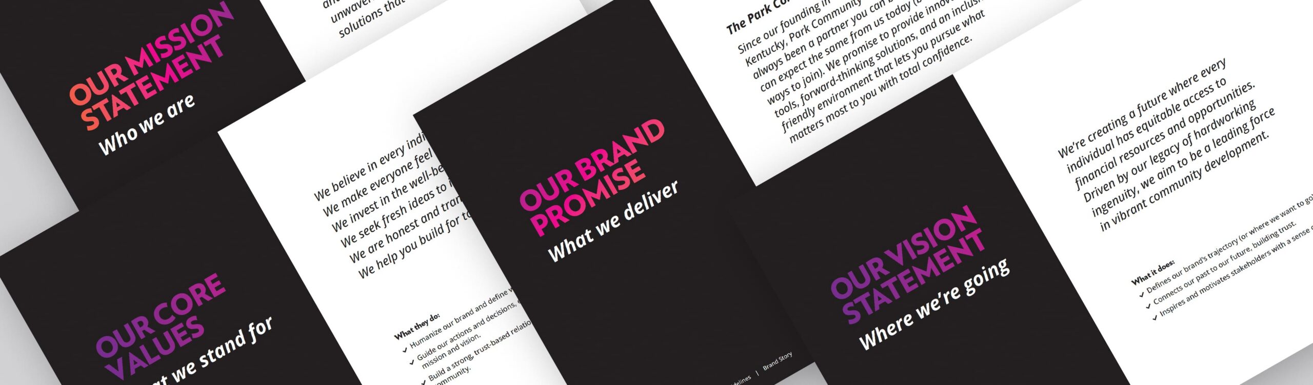
AW’s research revealed a powerful connection between Park’s CDFI mission and the audiences it serves: when people feel valued and included, they’re empowered to move forward. That insight shaped our development of the new brand positioning, “Building pride with belonging,” and a brand story including its mission, vision, promise, and values.
BRAND IDENTITY
Putting a fresh spin on history
Park was founded in 1965 by employees of General Electric’s Appliance Park, a legacy worth keeping as the brand evolved.
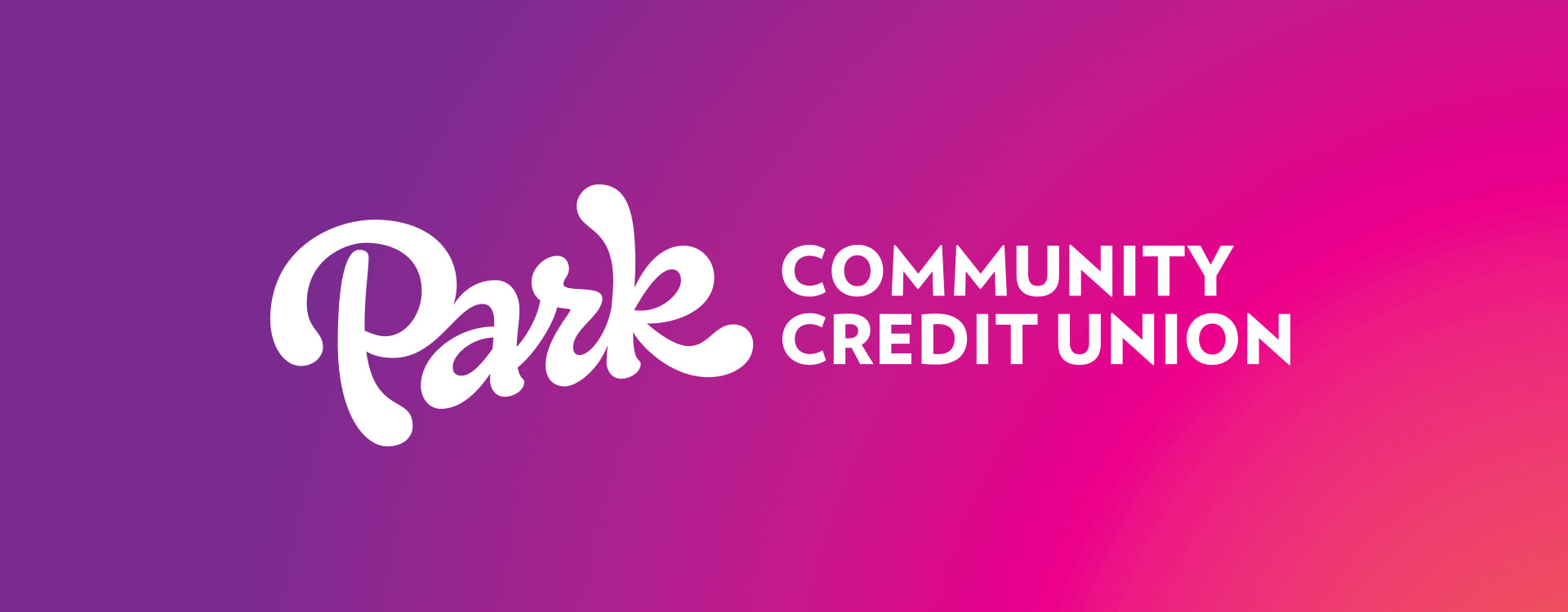
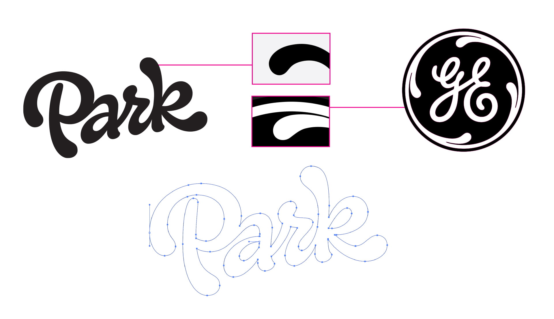
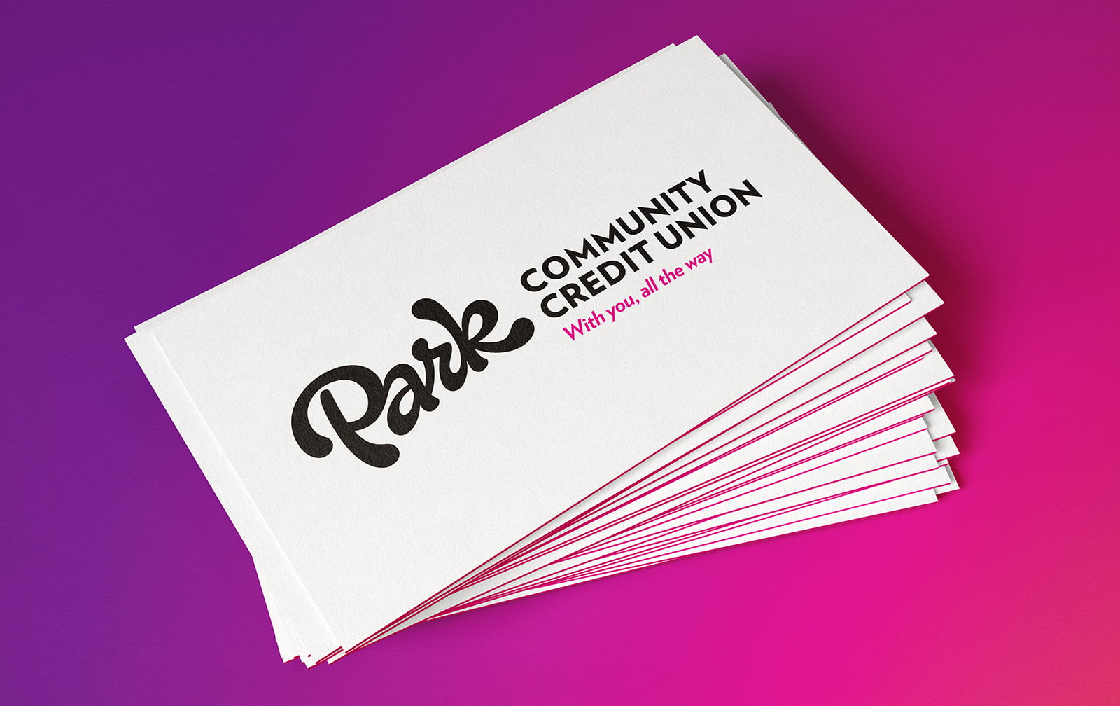
Rather than leave that history behind, we reimagined it. Park’s new handcrafted ScriptTag draws inspiration from the swirls of GE’s historic monogram, transforming that legacy into a bold, contemporary mark.
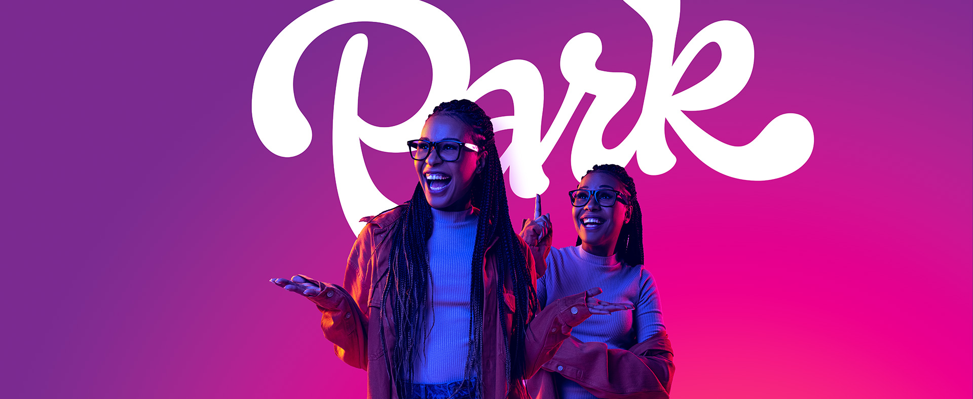
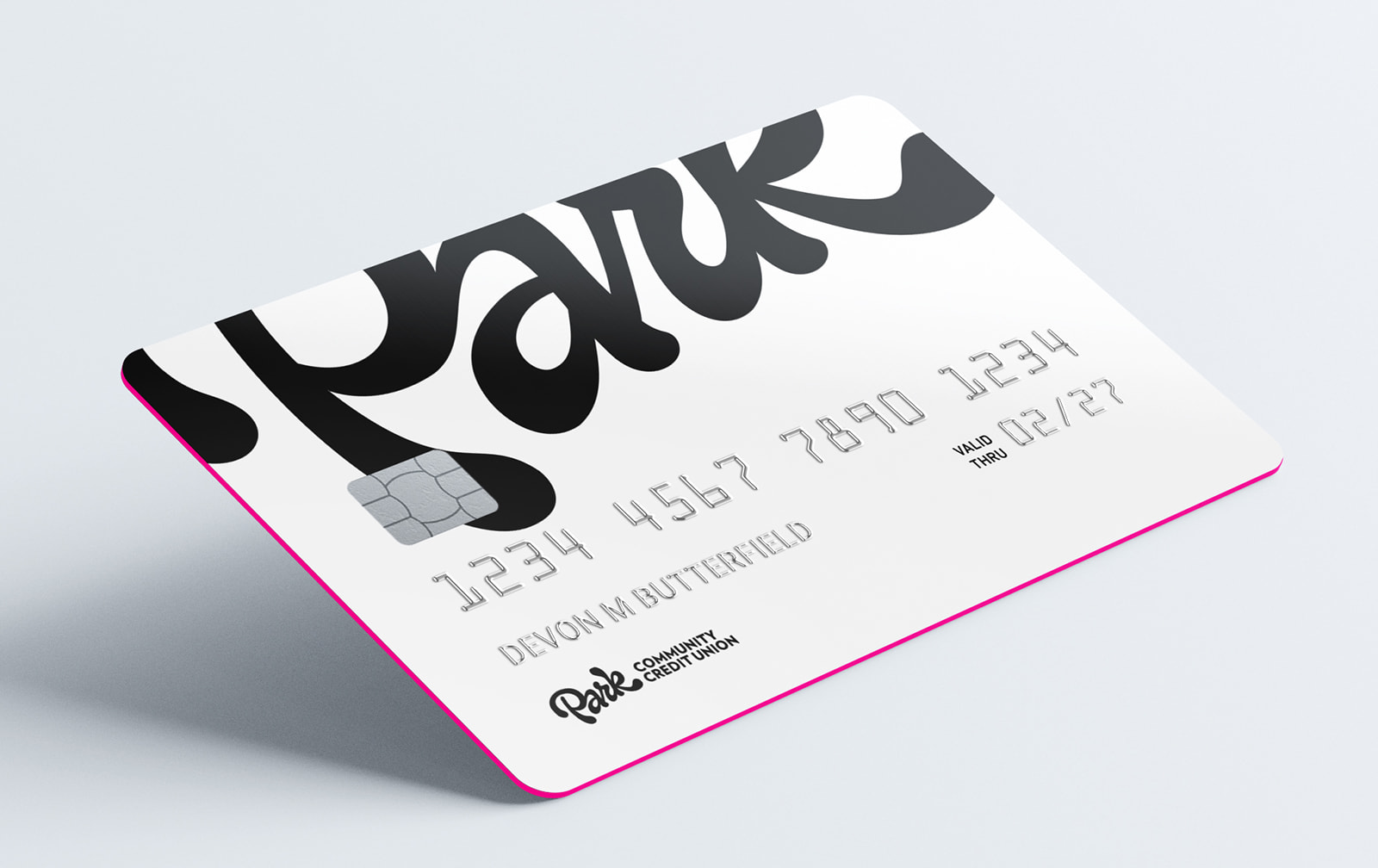
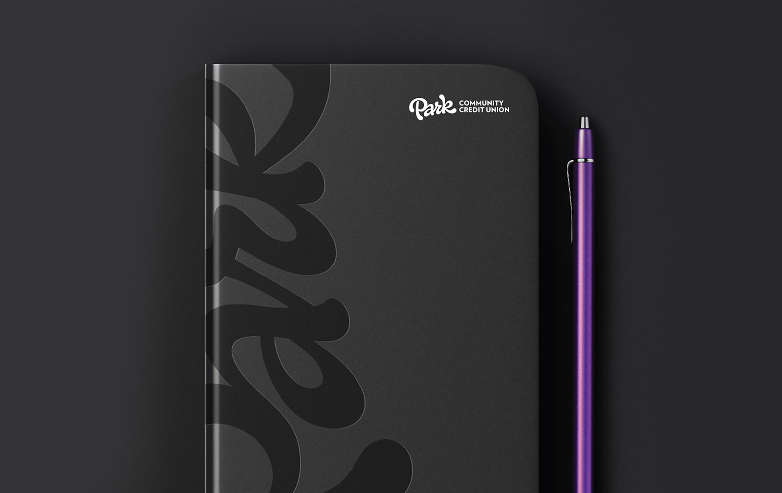
A confident black-and-white foundation, vibrant gradient, modern typography, and authentic photography complete an identity built to stand out in a crowded financial category.
TAGLINE
Five words. One big promise.
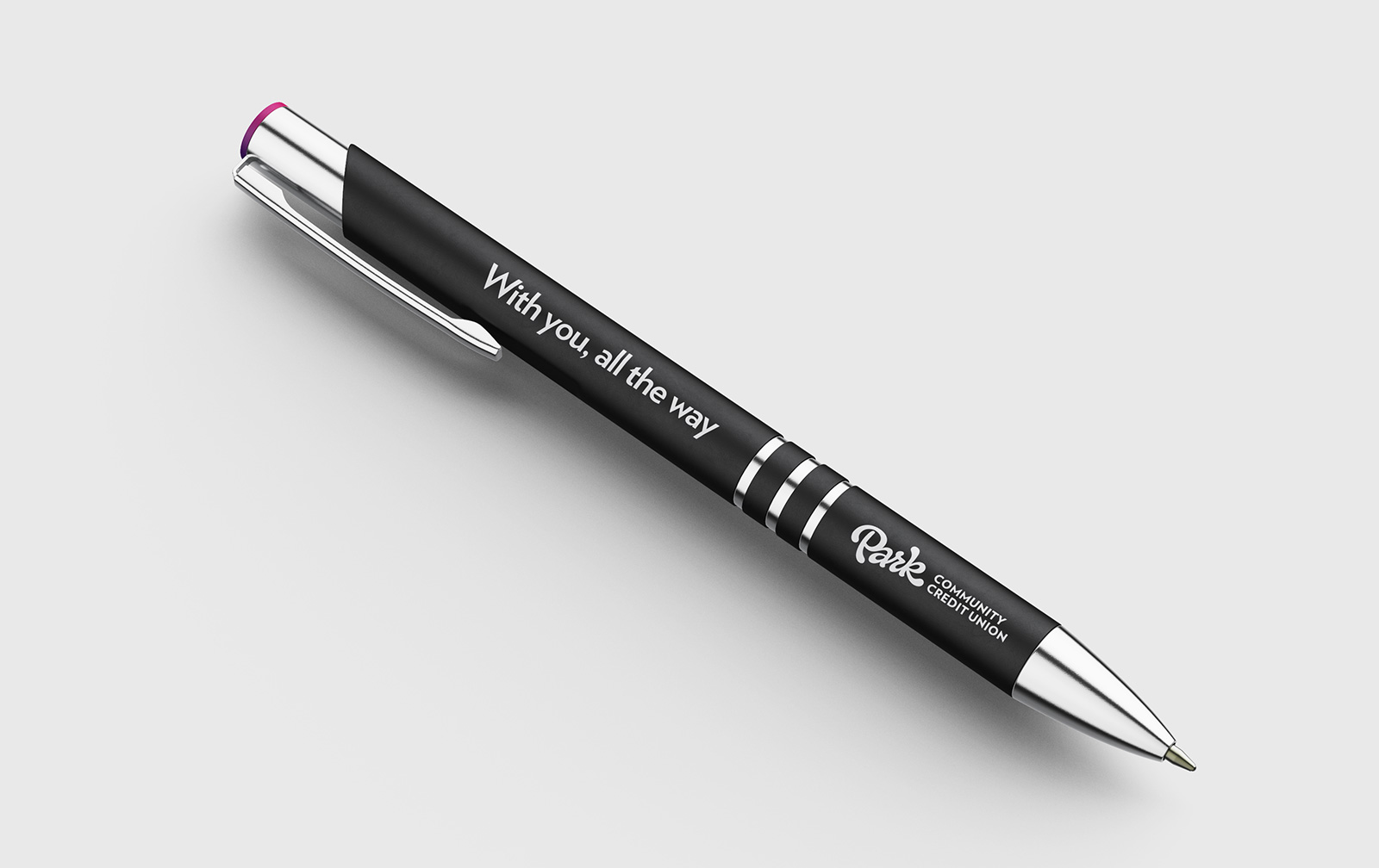
Park’s new tagline, “With you, all the way,” turns its role in members’ lives into a simple commitment: wherever they’re headed, they don’t have to get there alone.
Friendly, confident, and direct, the line reinforces the credit union’s role in guiding and supporting members, employees, and community members.

ENVIRONMENTAL DESIGN
Bringing the brand to life
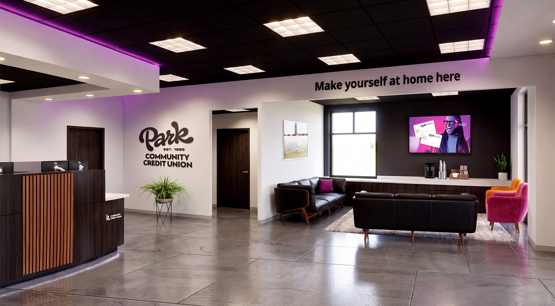
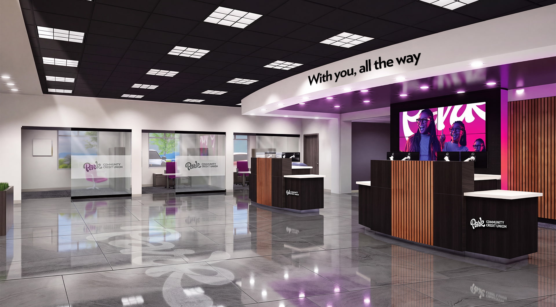
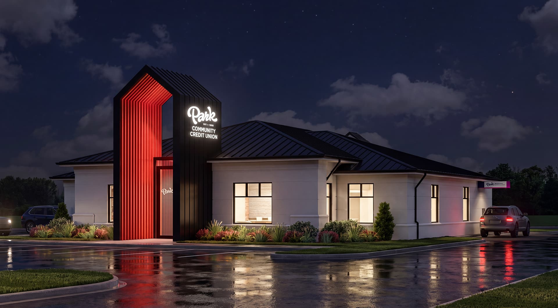
AW architected a scalable environmental branding strategy for Park’s 17 locations, adapting the new brand to the unique building layouts, visibility needs, and budgets.
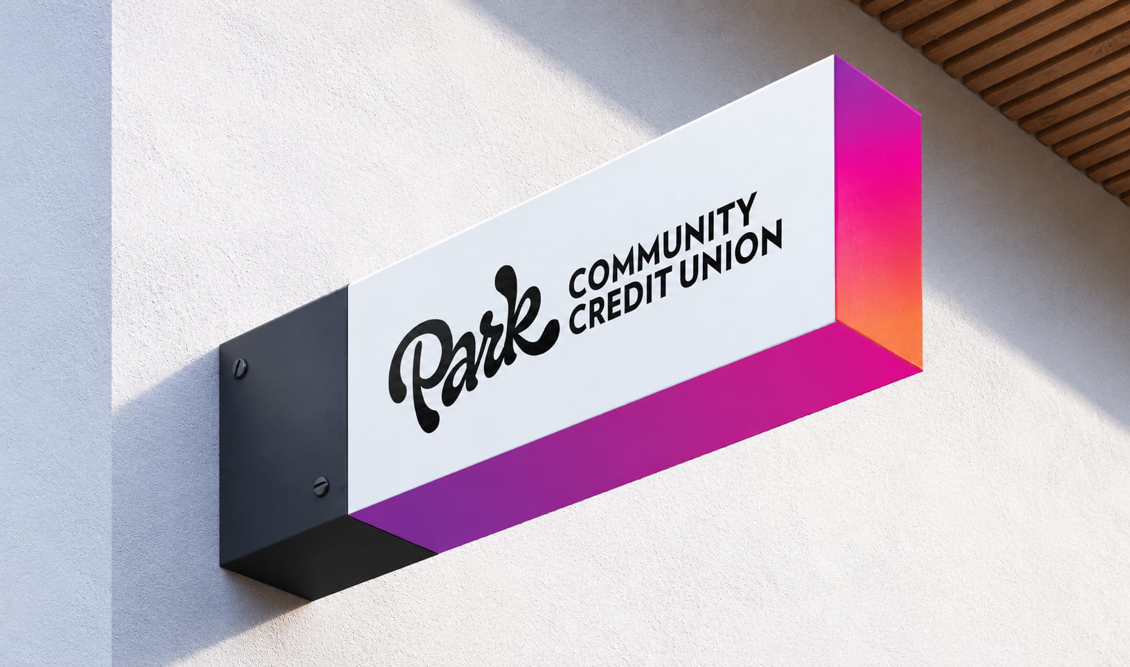
From dimensional logos to illuminated signage featuring the signature Park Gradient Glow, the system turned branches into highly visible expressions of the new brand.
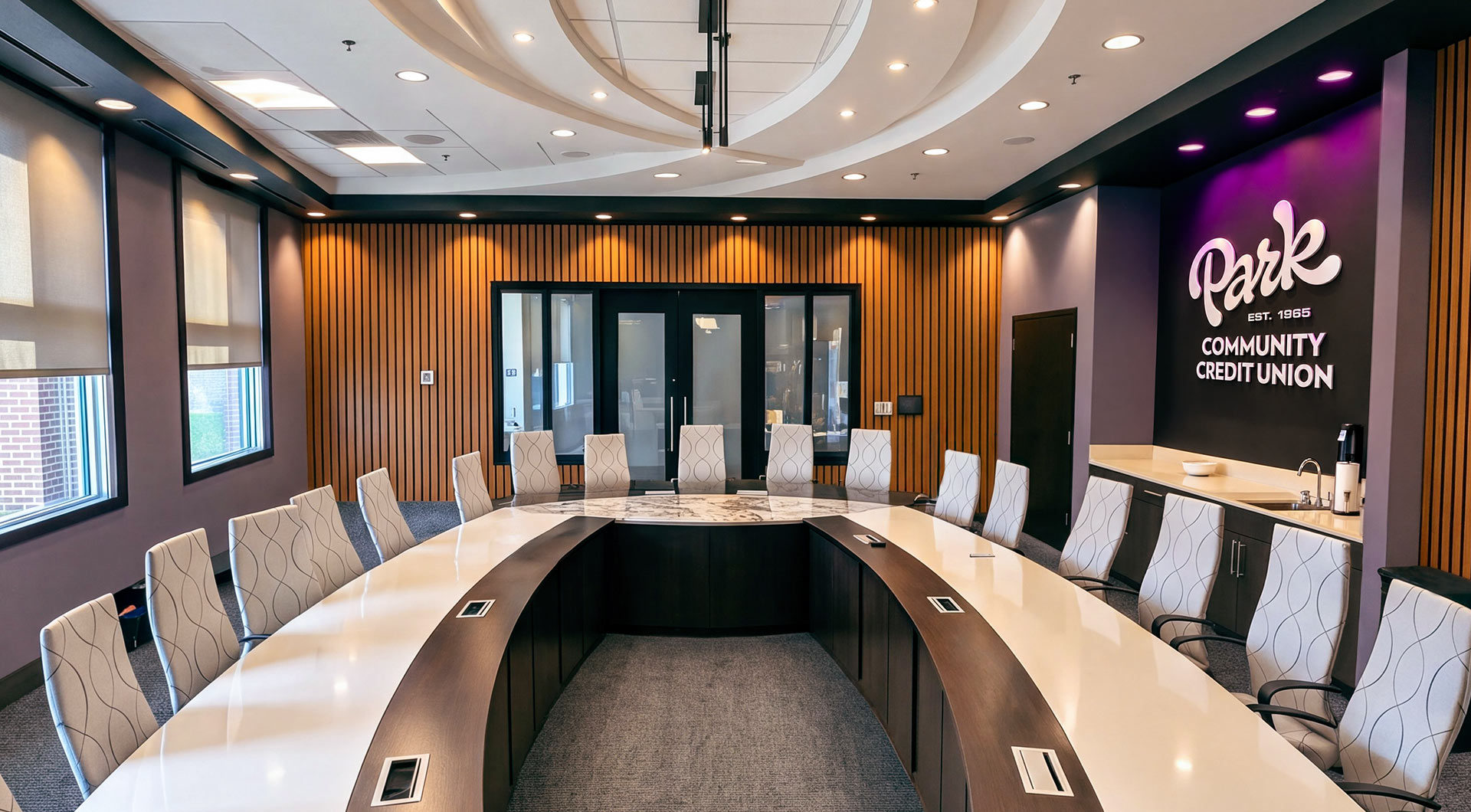
Beyond the branch experience, we expanded into corporate spaces and the boardroom, pairing Park’s bold visual identity with functional improvements designed for how its teams work today.
We preserved what already worked while rethinking the space for hybrid meetings, video calls, and content creation, making the environment more useful and more distinctly Park.
The result is one cohesive brand built to show Park is, quite literally, with you all the way.