Back

Orlin & Cohen

branding strategy fuels 27% practice growth

overview

Long Island’s leading orthopedic practice, Orlin & Cohen recently faced two challenges: Generate awareness in the supercompetitive New York City boroughs where they’re expanding their footprint, and stave off an influx of big-name, Manhattan-based competitors entering their existing territory—and bringing that “care is better in the City” mentality right along with them. Our research-based campaign delivers a one-two punch to drive in patients in new markets and fend off the increasingly tough competition in existing ones—achieving double-digit practice growth.

Integrated Marketing Campaign

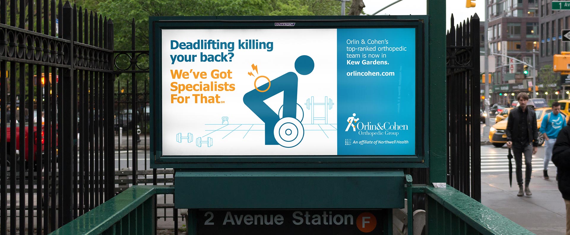
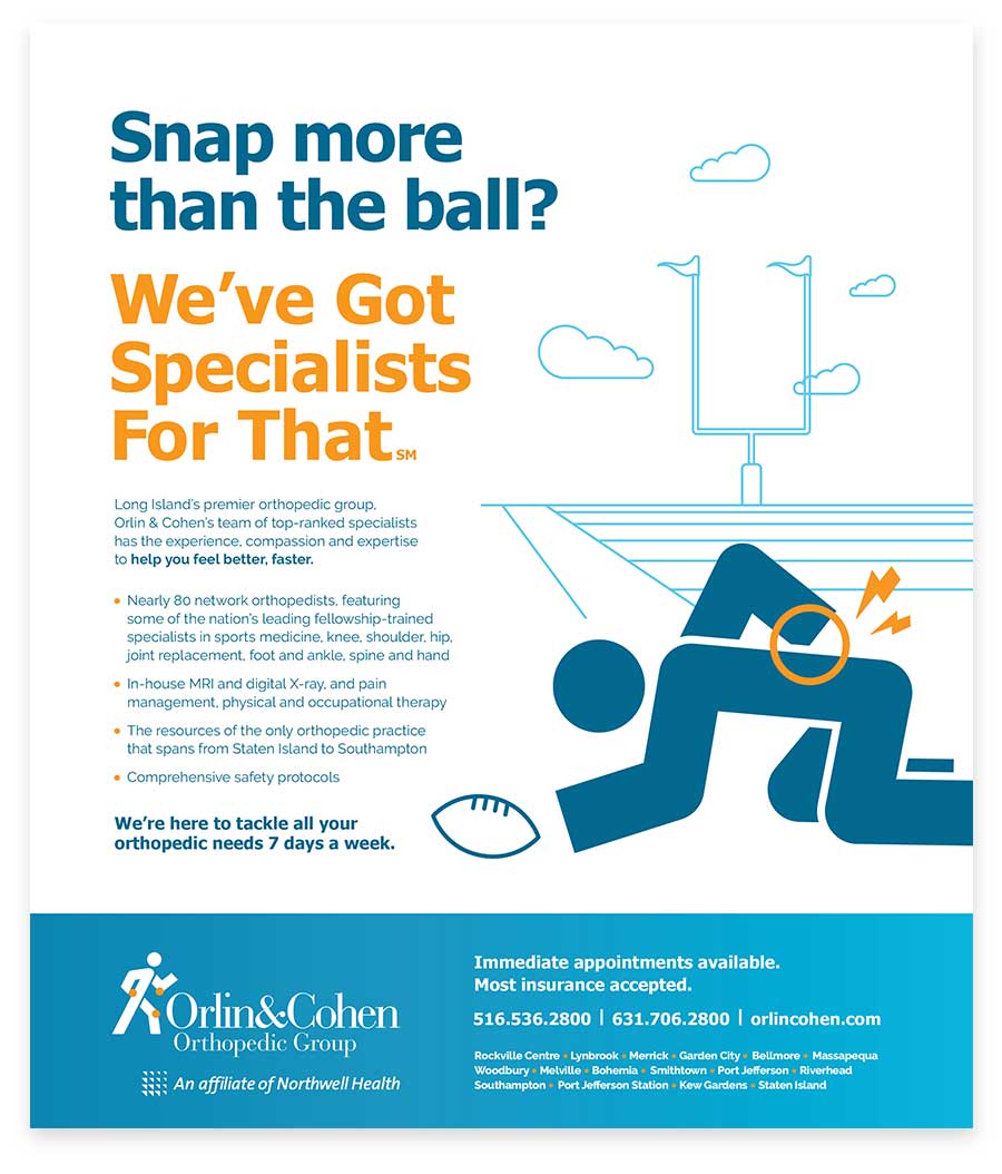
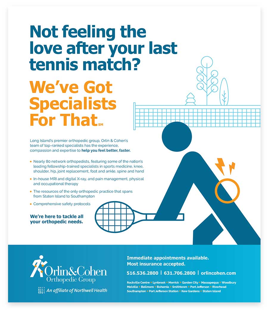
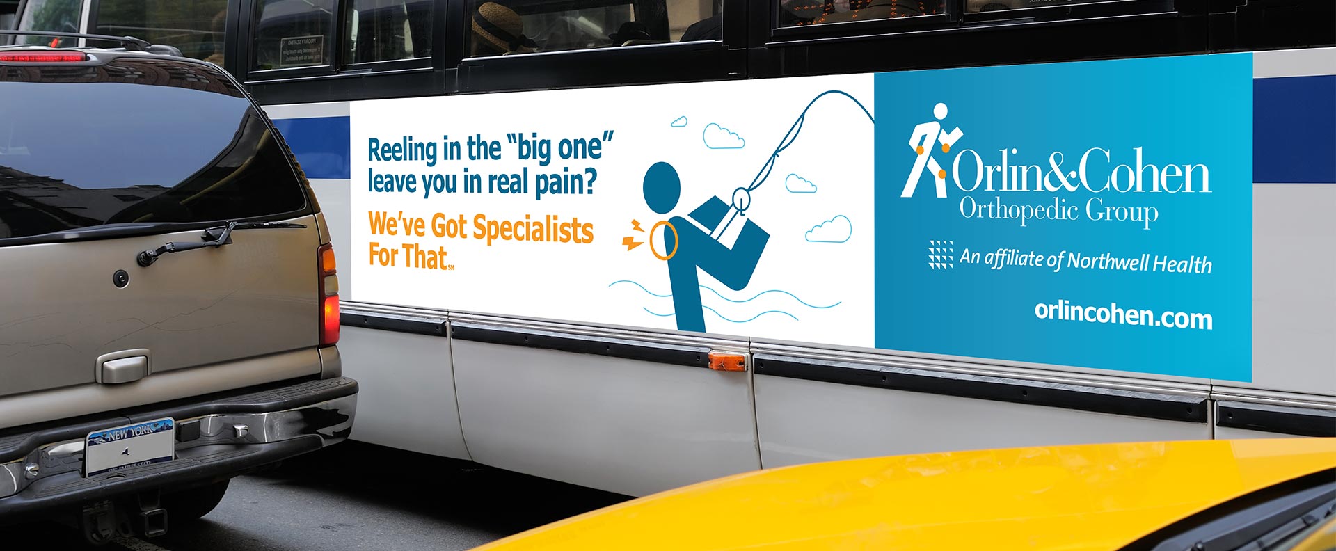
We’ve got real reasons to believe

Based on our research, we know that the top reasons consumers choose a local orthopedist are specialized expertise and top professional ranking. Our integrated campaign makes sure prospective patients know Orlin & Cohen’s got both.
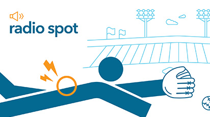
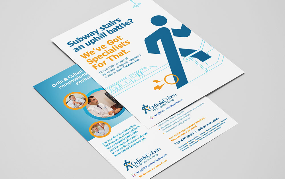
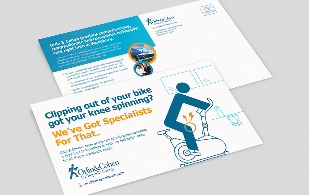
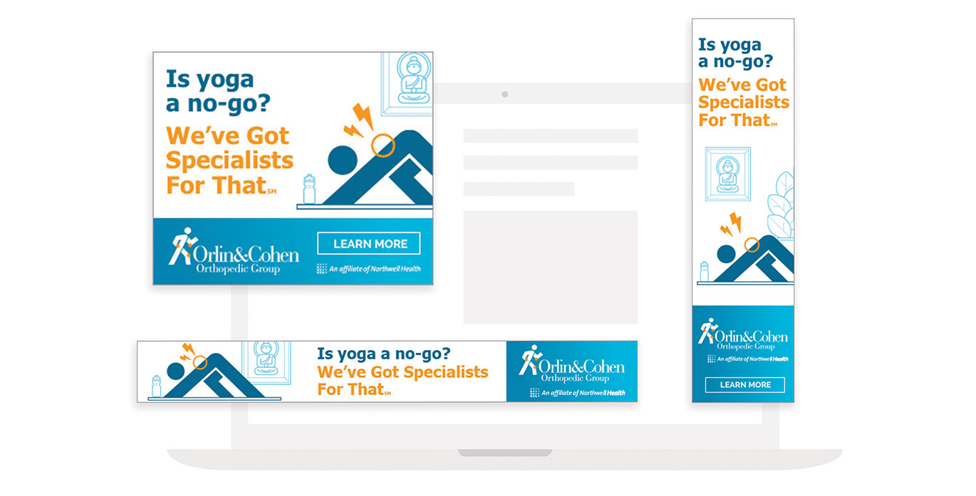
Illustration of a person with back pain. The person, bent over and holding their lower back, has a lightning bolt symbol indicating pain. In the background, there's a white picket fence, plants, and a tree. A small Orlin & Cohen logo is subtly incorporated into the scene for branding.
Illustration of a stylized figure diving to catch a baseball with a glove. The figure's back has an orange burst symbol with lightning bolts, indicating pain or injury. Orlin & Cohen's expertise shines in this blurred baseball field scenario, capturing the drama of sports injuries perfectly.
An abstract illustration of a tennis player in motion by Orlin & Cohen. The player, represented by simple shapes, is shown preparing to hit a tennis ball with a racket. Yellow shapes, like a bolt and a circle, emphasize the action. The background features trees and a net.
Illustration of a hockey player on hands and knees with yellow pain symbols near the neck and shoulder. A hockey puck is on the ice in front of the player, while a goalie stands in front of a goal. The background shows a blurred crowd in the stands, highlighting the intense moment. Orlin & Cohen can help alleviate such injuries.
A minimalist illustration featuring a stylized stick figure of a baseball player sliding into a base. The figure is reaching towards a ball with a glove.
Illustration of a person playing tennis, with an orange circle and lightning bolts near their shoulder, suggesting pain or injury. The text
Illustration of a person having hip pain, represented by a figure clutching their hip with pain lines emanating from it. In the background, there's an outline of a train and a sign, indicating a transit setting. The text
A billboard at a subway station entrance promotes Orlin & Cohen's orthopedic services with an illustration of a person deadlifting and text asking if deadlifting is causing back pain. The Orlin & Cohen billboard highlights their top-rated specialists in Kew Gardens.
Advertisement for Orlin & Cohen Orthopedic Group featuring a stylized drawing of a person crouched on a football field, clutching their knee in pain. Text highlights Orlin & Cohen's specialization in treating sports injuries, with contact information at the bottom.
Advertisement for Orlin & Cohen Orthopedic Group featuring text about their sports medicine services. The background includes a graphic of a tennis net and racquet, symbolizing their commitment to keeping athletes at peak performance. Orlin & Cohen's contact information and location details are provided at the bottom.
A bus advertisement displays a message:
Two medical-themed flyers lie on a surface. The top flyer features an illustration of a person on subway stairs with the text
A flyer for OrthoCarolina promotes orthopedic care in Woodbury. The front features an illustrated person on an exercise bike holding their injured knee, with text highlighting treatments for knee injuries. The back provides clinic information, a description of services, and references partnerships with experts like Orlin & Cohen.

DIGITAL

Generate immediate patient traffic

Hyperlocal digital strategies drove patients into the practice’s flagship facility, new Queens, New York office and other priority network locations.
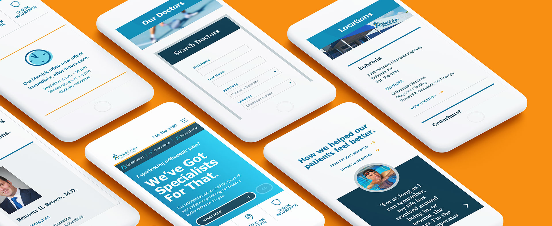
A person holding a smartphone displaying an advertisement for OrthoBethesda Orthopedic Group. The ad features a graphic of a person running with a highlighted knee in pain. The text reads,
Three digital banner ads for Orlin & Cohen Orthopedic Group displayed on a computer screen. The ads contain text:

website development

Double online appointment requests

Leveraging the new campaign creative, a solid search engine optimization strategy and conversion-focused architecture, this new mobile-first website delivers a consistent (and improved) experience for visitors—driving a 200% increase in appointment requests the very first month.

A computer monitor and a laptop both display the Orlin & Cohen medical website with blue and white color schemes. The screen shows an illustration of a person with joint pain and text that reads

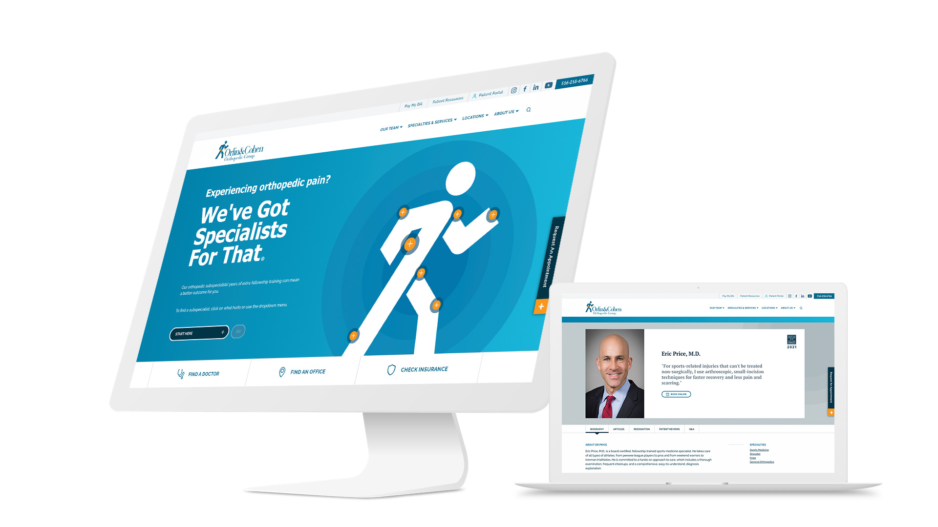
The practice’s “running man” brand icon does double duty as a simple navigational tool: By clicking on where it hurts, prospective patients find a subspecialist and office closest to them—without ever leaving the home page.

A series of smartphone screens displaying the Orlin & Cohen medical app interface with options for searching doctors, viewing locations, reading testimonials, and doctor profiles. The background is bright orange, and each screen showcases a different aspect of the app's features.
Outcomes

34%

improvement in new patient acquisition costs for paid media year-over-year

200%

increase in online appointment requests

27%

practice growth in the year after flagship office opening

map-icon
contact-icon

Get ready to be inspired. Subscribe now.